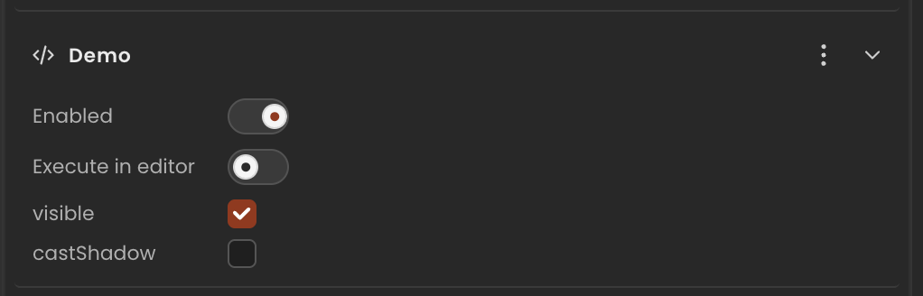
CheckboxInput
A checkbox. The inspector renders a standard checkbox control.
Runtime value: { type: "checkbox"; value: boolean } — read .value
Declaration
Declare with a type: "checkbox" envelope and an initial value:
ts
import { Behaviour, type CheckboxInput } from "@relu-interactives/spatial-ecs";

export default class Demo extends Behaviour {
  data = {
    visible:    { type: "checkbox", value: true }  as CheckboxInput,
    castShadow: { type: "checkbox", value: false } as CheckboxInput,
  };
}
Runtime usage
Read the .value property:
ts
onUpdate() {
  if (!this.data.visible.value) return;
  // ... rest of update logic
}
Notes
- Use
CheckboxInputfor property-style options (e.g. "Cast shadow", "Visible") andToggleInputfor simple on/off feature flags. ToggleInputis a plainbooleanand requires no envelope — use it when you don't need the checkbox visual.