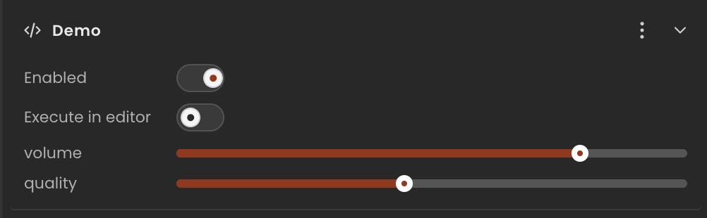
SliderInput
A range slider. The inspector renders a horizontal slider with the current value displayed alongside it.
Runtime value: { min: number; max: number; step: number; value: number } — read field.value
Declaration
Provide the full object including min, max, step, and the initial value. The editor reads min/max/step to configure the slider control.
ts
import { Behaviour, type SliderInput } from "@relu-interactives/spatial-ecs";

export default class Demo extends Behaviour {
  data = {
    volume:  { min: 0, max: 1, step: 0.01, value: 0.8 } as SliderInput,
    quality: { min: 1, max: 10, step: 1, value: 5 } as SliderInput,
  };
}
Runtime usage
Read the .value property — the other fields (min, max, step) are for the editor control only:
ts
onUpdate() {
  const volume = this.data.volume.value; // number between 0 and 1
}
Notes
- Always include
min,max, andstepin the inline default — the editor needs them to render the control. stepcan be fractional for smooth sliders (e.g.0.01).